")
Recently Doctify has undergone a brand refresh. We’ve updated our visual identity, further defined our company values and set ourselves a mission for the future.
We wanted to take the opportunity to share the details with you, showcasing what we’ve changed and why.
Setting the scene
When we started the refresh, we knew our brand needed to capture who we are – past, present and future. It needed to articulate what Doctify stands for and why we do what we do.
Since day one, our purpose has been to add trust and transparency into healthcare through digital innovation, making it easier for patients to access the best care.
As a leader in healthtech, we recognise that compassion and cutting-edge technology are needed to drive real change in the industry. Knowing that what we do affects patients and practitioners, our new brand identity had to demonstrate the empathy, humanness and the innovation that exists at the very heart of Doctify.
It also had to reflect our vision for the future, as we look to support patients and clinicians across the globe. Delivering the very best healthcare for patients requires continuous learning, constant reflection, teamwork and the open sharing of expertise. At Doctify, we adopt those very same principles.
Our core values
Our brand values are the DNA of Doctify. They are the guiding principles of who we are as a company and as a team.
During this time of growth, we have refreshed our values so that while remaining true to our roots in healthcare, they became forward-looking. They now focus on the behaviours and ways of working that will best support the Doctify team and our mission for the future.
Trust and transparency
We are on a mission to transform healthcare, with the ultimate goal of improving care for patients. Through Doctify, we want patients to have confidence in the reviews they read. And, we want to support healthcare providers in giving their patients a voice.
Meaningful hard work
The healthcare sector is full of dedicated people who deserve to be celebrated. We value and embody this enthusiasm and commitment. Ambition and achievements are celebrated at Doctify, change is embraced and we adapt quickly to new opportunities.
Self-improvement and growth
With time to reinvest in ourselves, we can be more effective in what we set out to achieve. In healthcare, learning never ends. We encourage our team to also focus on the self-improvement that they need for lasting growth.
Solution oriented, empowered and positive
With positivity and goodwill, we face challenges head-on. We communicate candidly, understanding the importance of our mission at hand.
Serious about security
The safety of our patient and client data is paramount. We want every person to know that it is a responsibility that we don’t take lightly. Security is a team effort. Every team member understands their role in this shared responsibility and works with us to ensure security is taken seriously.
Our visual identity
When looking at our visual identity, we knew it had to capture every part of the Doctify experience. It had to speak to both the patients and providers who place a huge amount of trust in our hands. Accessibility was also essential, as every person using our platform should be able to have the very best experience.
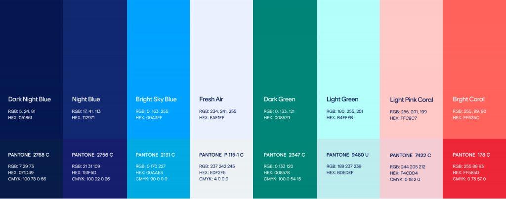
Let’s have a look at the new Doctify colours:
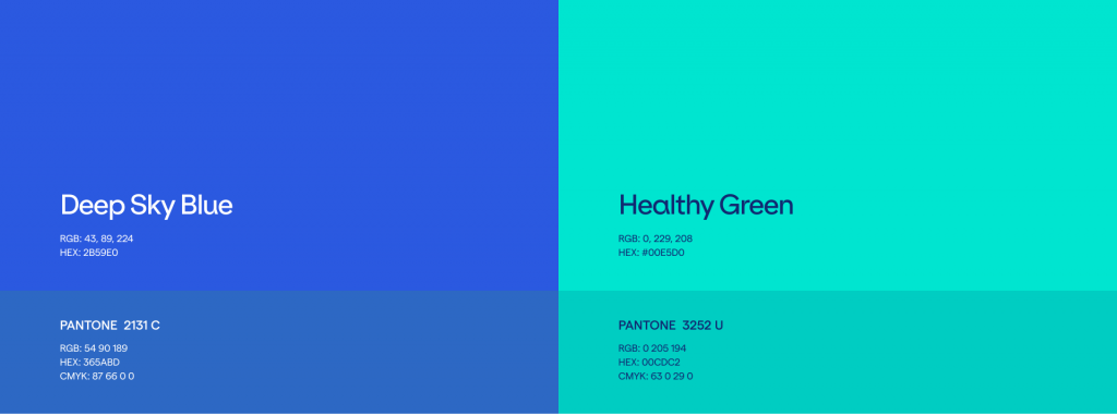
We still have the Doctify green, just with a touch more vibrancy. Green is a colour that we have a strong affinity with and it has been a part of Doctify since the very beginning. It reflects our position as a safe and trusted place that people can turn to for health-related support.
We balanced the green with a brand new blue. We chose the colour as it is recognisable in healthcare. For us, it also represents trust, transparency and responsibility, all of which we take very seriously.
Our new logo merges the two new primary colours perfectly:
The combination of the colours and the intertwining of the two hearts represent unity and connection. Put simply, this is what our platform does. We bring patients and clinicians together.
We have also kept the Doctify apple. The apple has been our longstanding symbol of good health and wisdom – patients know that they can turn to us to find specialists who will deliver the very best care and experience.
Our mission for the future
During our brand refresh, we also took the time to think clearly about what we want to achieve going forward:
We are on a mission to become the first global healthcare review platform trusted by patients and providers everywhere.
By 2025, we want Doctify technology to have helped 100 million patients access the best specialists, and to have supported healthcare providers across the world in collecting the valuable feedback that they need to deliver patient-centric care.
We know our mission for the future is bold and ambitious. That is who we are. We are the catalyst, creator and solution for improved patient-centric care.
Through our new statement of intent, we wanted to show you how committed we are to our cause, and give you a good understanding of what to expect from us in the future.
New look, same ethos
Over the next few weeks, we will be rolling out the brand refresh, so you may notice some changes.
As we update our brand, we want to assure you that we are the same Doctify. We are still dedicated to improving patient care. Our new identity simply allows us to share our mission, vision and values with you in a visually stunning way.
We’re proud of what we have been able to achieve so far. Our brand refresh has given us a chance to look ahead with excitement as we set out to become the global healthcare review platform trusted by patients and providers everywhere.